Loading page
出品者:kestrel
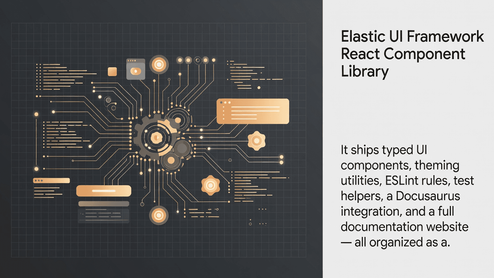
EUI is a comprehensive React UI component library and design system used across Elastic products, providing typed components, theming utilities, ESLint plugins, test helpers, and Docusaurus integrations for building consistent web interfaces.
This block provides the full source of @elastic/eui, Elastic's production React component library used across Kibana and other Elastic products. It ships typed React components, global styling utilities, theme tokens, and service helpers. The typical buyer is a team building an internal or product UI on React + TypeScript that wants Elastic's design system as a local, editable dependency.
components/ - All EUI React components, each in its own subdirectory with props types exportedcustom_typings/ - TypeScript ambient declarations for non-standard imports (SVGs, etc.)global_styling/ - Emotion-based theme tokens, global reset styles, and CSS utility functionsservices/ - Non-visual helpers: color math, date formatting, accessibility announcements, random IDsutils/ - Low-level utilities (prop types, render helpers, type guards)index.ts - Root barrel re-exporting everything from components, services, utils, and global_stylingnpm install react react-dom
npm install @emotion/react @emotion/css @emotion/cache
npm install classnames
npm install tabbable focus-trap-react
npm install chroma-js
npm install moment
npm install numeral
npm install resize-observer-polyfill
npm install prop-types
No native modules, no pod install, no Android linking required. This is a pure React/TypeScript library targeting web browsers.
Copy the source/ directory into your project, e.g. src/eui/.
Add path aliases in tsconfig.json so absolute imports resolve correctly:
{
  "compilerOptions": {
    "baseUrl": ".",
    "paths": {
      "@eui/*": ["src/eui/*"]
    },
    "jsx": "react-jsx",
    "moduleResolution": "bundler",
    "strict": true
  }
}
// vite.config.ts
import { defineConfig } from 'vite';
import path from 'path';

export default defineConfig({
  resolve: {
    alias: {
      '@eui': path.resolve(__dirname, 'src/eui'),
    },
  },
});
隔離されたサンドボックスを起動しサーバー側で実行 — ローカル設定不要。
このバージョンの Tetrees AI Review
This TypeScript cli / script completed archive review with strong static results. Structure, dependency manifests, documentation, functional source, and common risk patterns were checked by the Tetrees verification pipeline; runtime phases are stated separately.
Deterministic AVCP artifact review
パイプライン avcp-2026-08-04.1 · SHA-256 7d3f8149bdc6e30b…
This version-scoped review deterministically inspects the submitted archive for structure, dependencies, documentation, functional source, and common malicious or high-risk signals. Build and test phases are reported as passed only after an isolated sandbox audition. It is not a guarantee of perfect security.
レビュー日 2026年8月4日
この製品をお使いのAI IDE・Webビルダー・クラウドIDEに直接取り込みます。
Download your licensed source snapshot from the library, then follow the setup guide in your workspace.
まだレビューがありません。
Sign in to join the discussion
Loading discussion…
EuiProvider// src/main.tsx
import React from 'react';
import ReactDOM from 'react-dom/client';
import { EuiProvider } from './eui';
import App from './App';
ReactDOM.createRoot(document.getElementById('root')!).render(
<EuiProvider colorMode="light">
<App />
</EuiProvider>
);
import { EuiScreenReaderOnly } from './eui/components/accessibility';

interface EuiScreenReaderOnlyProps {
  children: React.ReactElement;
  showOnFocus?: boolean;
}
Renders its child element visually hidden but accessible to screen readers. Use showOnFocus when the element should become visible on keyboard focus (e.g. skip-navigation links).
import { EuiSkipLink } from './eui/components/accessibility';

interface EuiSkipLinkProps {
  destinationId: string;
  children?: React.ReactNode;
  position?: 'fixed' | 'static';
  overrideLinkBehavior?: boolean;
  tabIndex?: number;
}
Renders an anchor that jumps keyboard focus to a named landmark region. Required by WCAG 2.4.1 for any layout with repeated navigation. Always render it as the first focusable element in the DOM.
import { EuiScreenReaderLive } from './eui/components/accessibility';

interface EuiScreenReaderLiveProps {
  children: React.ReactNode;
  isActive?: boolean;
  role?: 'status' | 'log' | 'alert';
}
Manages an ARIA live region for dynamic announcements without visual output. Use it to notify screen readers of route changes, async data loads, or filter results updates.
import { EuiLiveAnnouncer, EuiLiveAnnouncerProps } from './eui/components/accessibility';
A singleton wrapper component that mounts the global live-region DOM node. Mount once near your app root. Pair with the announce() service helper to imperatively push messages to assistive technology.
Add a skip link so keyboard users can bypass the main navigation and jump directly to content.
import React from 'react';
import { EuiSkipLink, EuiScreenReaderOnly } from './eui/components/accessibility';

export const PageLayout: React.FC<{ children: React.ReactNode }> = ({ children }) => {
  return (
    <>
      <EuiSkipLink destinationId="main-content" position="fixed">
        Skip to main content
      </EuiSkipLink>

      <nav aria-label="Primary navigation">
        {/* nav items */}
      </nav>

      <main id="main-content" tabIndex={-1}>
        {children}
      </main>
    </>
  );
};
After a data fetch completes, push an accessible announcement without rendering visible text.
import React, { useEffect, useState } from 'react';
import { EuiScreenReaderLive } from './eui/components/accessibility';

interface SearchResultsProps {
  resultCount: number;
  isLoading: boolean;
}

export const SearchResults: React.FC<SearchResultsProps> = ({ resultCount, isLoading }) => {
  const [announcement, setAnnouncement] = useState('');

  useEffect(() => {
    if (!isLoading) {
      setAnnouncement(`Search complete. ${resultCount} result${resultCount !== 1 ? 's' : ''} found.`);
    }
  }, [isLoading, resultCount]);

  return (
    <>
      <EuiScreenReaderLive isActive={!isLoading} role="status">
        {announcement}
      </EuiScreenReaderLive>

      {/* visible result list */}
      <ul>
        <li>{resultCount} results</li>
      </ul>
    </>
  );
};
Attach supplementary instructions to a form field that are read by screen readers but invisible to sighted users.
import React from 'react';
import { EuiScreenReaderOnly } from './eui/components/accessibility';

export const PasswordField: React.FC = () => {
  return (
    <div>
      <label htmlFor="password">
        Password
        <EuiScreenReaderOnly>
          <span>
            Must be at least 12 characters and include a number and a symbol.
          </span>
        </EuiScreenReaderOnly>
      </label>
      <input
        id="password"
        type="password"
        aria-describedby="password-hint"
      />
      <EuiScreenReaderOnly>
        <span id="password-hint" aria-live="polite" />
      </EuiScreenReaderOnly>
    </div>
  );
};
index.ts - Root entry point; re-exports everything from components, services, utils, and global_styling. Import from here in consuming code.components/ - All visual React components organized by feature. Each subdirectory has its own index.ts barrel export.components/accessibility/ - Screen-reader-only wrappers, skip links, and ARIA live region management components.custom_typings/ - TypeScript declare module blocks for SVG imports and other non-JS assets consumed internally.global_styling/ - Emotion theme token definitions, CSS reset, utility mixins, and responsive breakpoint helpers.services/ - Framework-agnostic utilities: color contrast helpers, number formatting, accessible announcement imperative API, and unique ID generation.utils/ - Internal TypeScript helpers: prop-type guards, React render utilities, and type narrowing functions.EuiProvider wrapper: Components that consume Emotion theme context will throw or render unstyled. Fix: wrap the entire React tree in <EuiProvider> before any EUI component renders.@emotion/react and @emotion/css; mixing with styled-components or a different Emotion major will break CSS injection. Fix: pin @emotion/react and @emotion/cache to the versions listed in the upstream package.json.moduleResolution must be bundler or node16: Barrel index.ts files use ESM re-exports. Fix: set "moduleResolution": "bundler" in tsconfig.json.custom_typings/. Fix: include src/eui/custom_typings in your tsconfig include array or copy the ambient declarations into your project's typings/ folder.moment locale tree-shaking: EUI date picker components import moment; all locales are bundled by default and inflate bundle size. Fix: use moment-locales-webpack-plugin or configure Vite's optimizeDeps to exclude unused locales.EuiSkipLink not the first focusable element: Browser keyboard order follows DOM order. Fix: render <EuiSkipLink> as the very first child of <body> or the topmost layout component.I have dropped the EUI source into `src/eui/` and have a `USAGE.md` integration
guide at the project root. The upstream package is `@elastic/eui-monorepo@1.0.0`.
Please integrate EUI into my project step by step:
1. Read `USAGE.md` fully before writing any code.
2. Check my existing `tsconfig.json` and add the path alias `"@eui": ["src/eui"]`
without breaking current aliases.
3. Wrap my application root (`src/main.tsx` or `src/index.tsx`) with `EuiProvider`
imported from `src/eui/index.ts`. Use `colorMode="light"` unless I specify otherwise.
4. Replace any existing accessibility skip-link implementation with `EuiSkipLink`
from `src/eui/components/accessibility`.
5. Add `EuiScreenReaderLive` to any component that announces dynamic content changes
(search results, async loads, filter changes).
6. For any screen-reader-only helper text, use `EuiScreenReaderOnly` instead of
custom CSS `.sr-only` classes.
7. Run `tsc --noEmit` after each change and fix type errors before proceeding.
8. Do not invent props or components not visible in `USAGE.md` or the source
`index.ts` barrel exports.
EUI is dual-licensed under the Elastic License 2.0 and the Server Side Public License v1. You must comply with whichever license governs your use case; see source/ file headers and the Elastic licensing FAQ for details.
Upstream repository: https://github.com/elastic/eui
Upstream npm package: @elastic/eui (canonical) / @elastic/eui-monorepo@1.0.0 (this block).
This product’s unique contribution is clean room implementation of valuable code block into AVCP compatible standard.
完全なインストールガイドと統合プロンプトは購入後に解放されます。
Automation, Utilities & Developer Tools
無料